
Case study:
Nationwide Design Guides.
Re-architecting internal design guidance to support scale, consistency, and adoption.
The Challenge.
Nationwide’s Experience Language website was originally built to host a limited set of “how-to” guides.
As the design system matured, the platform needed to support:
-
new content categories,
-
an experience toolkit,
-
downloadable assets,
-
ongoing growth without degradation of usability.
Without intervention, the increasing volume of content risked:
-
poor discoverability,
-
inconsistent usage of standards,
-
reduced adoption of the design system,
-
increased reliance on tribal knowledge and direct support.
I was tasked with reimagining how internal design guidance was navigated and consumed.

Design Strategy.
I approached this as a knowledge architecture problem.
Internal platforms succeed or fail based on:
-
how quickly people can find what they need,
-
how clearly content is categorised,
-
whether usage scales with organisational growth.
The goal was to create an experience that:
-
supported multiple content types,
-
aligned with existing experience language patterns,
-
reduced cognitive load for designers and contributors,
-
encouraged self-service and reuse.

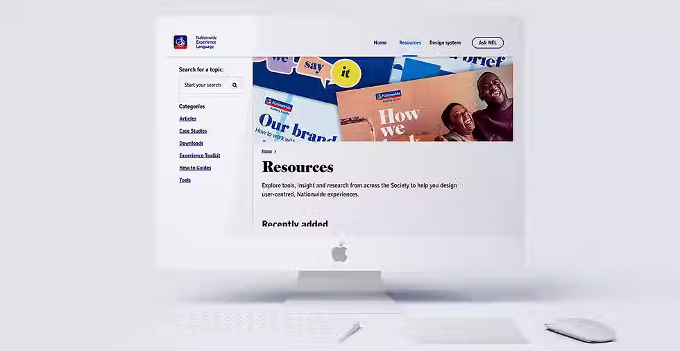
Reframing the Information Architecture.
From single category to scalable system.
Previously, the site only supported one content type (“How-to” guides).
The redesign introduced:
-
multiple top-level categories,
-
an experience toolkit,
-
a dedicated area for downloadable assets.
This required a clear, extensible IA that could accommodate future growth without repeated redesign.
Secondary navigation for orientation:
To support the expanded content set, I introduced a persistent secondary navigation aligned to the left of the viewport.
This decision:
-
matched established patterns across the experience language site,
-
allowed clear categorisation of content,
-
provided users with constant orientation,
-
reduced reliance on long scrolling or page hopping.
Navigation design was driven by usability rather than novelty, prioritising predictability and speed.

Search as a Core Enablement Feature.
As content volume increased, browsing alone became insufficient.
I designed and integrated an enhanced internal search, allowing users to:
-
quickly locate specific guidance,
-
jump between related resources,
-
reduce time spent scanning long lists.
Search transformed the platform from a static reference site into an active working tool for day-to-day design and delivery.
Impact:
-
faster access to standards and guidance,
-
reduced interruption and ad-hoc questions,
-
increased confidence in applying the design system correctly.

Consistency & Alignment.
Throughout the redesign, I ensured:
-
visual and interaction consistency with the wider experience language ecosystem,
-
familiar patterns to reduce relearning,
-
clear hierarchy across guides, toolkits, and assets.
This reinforced the platform as a trusted source of truth, rather than a separate or secondary resource.

The Solution.
The redesigned guides platform delivered:
-
a clearer, scalable site architecture,
-
improved UX and content discoverability,
-
searchable access to growing design resources,
-
stronger alignment with the Experience Language system.
Main outcomes:
-
increased adoption of design standards,
-
reduced onboarding time for new designers,
-
lower dependency on direct support from the design system team,
-
greater consistency across Nationwide’s digital experiences.