Imagine Design System.
Establishing a scalable design system to support rebrand, accessibility, and operational efficiency.
The Challenge.
Imagine Cruising undertook a full rebrand while simultaneously rebuilding its commercial website. A high-risk moment where inconsistency and technical debt can quickly compound.
As their senior designer, I was responsible for designing and operationalising a scalable design system that:
-
Encoded the new brand into reusable components,
-
Supported rapid delivery without sacrificing quality,
-
Aligned designers and engineers around shared standards,
-
Reduced long-term maintenance and rework.
This work required balancing brand expression and system rigour in a commercial environment with a broad, older user demographic.

Strategy & Design.
I framed the system not as a visual style guide, but as infrastructure. A foundational layer that would support multiple teams and future change.
To reduce risk and uncertainty, I broke the work into three strategic phases:
-
Research and landscape analysis,
-
Audit and rationalisation of existing UI,
-
System design, documentation, and adoption.
This approach ensured the system was grounded in real usage and technical constraints.

Research & Landscape Analysis.
I began by surveying existing best practices and system models, drawing on:
-
Prior experience building component-based systems at Booking.com,
-
Atomic Design principles (Brad Frost),
-
Industry examples, tools, and emerging standards.
The scope extended beyond UI components. We needed:
-
A consumable pattern library,
-
Clear documentation and governance,
-
Alignment with engineering workflows to prevent divergence.
This early framing helped avoid the common pitfall of creating a system that looks good but fails in adoption.

UI Audit & Behavioural Analysis.
I conducted a comprehensive audit of the existing site, cataloguing:
-
UI components,
-
Spacing, typography, and colour usage,
-
Interaction patterns such as CTAs and navigation.
Where appropriate, I preserved learned user behaviours to avoid unnecessary disruption.
Heat mapping and Google Analytics were used to validate:
-
High-traffic areas,
-
Interaction friction,
-
Opportunities to reduce complexity.
Impact:
-
Reduced risk during rebrand by retaining familiar patterns,
-
Fewer regressions caused by behavioural changes,
-
Clear prioritisation of what needed rebuilding versus salvaging.

Securing Stakeholder Buy-In.
Before committing to system build, I worked directly with stakeholders to secure alignment and funding.
I positioned the system in terms of business outcomes, not design aesthetics:
-
Faster delivery through reuse,
-
Fewer inconsistencies and versioning issues,
-
Clearer communication between teams,
-
Reduction of design and technical debt over time.
This helped shift the conversation from “nice to have” to “critical infrastructure”.

Designing the System.
Scalability, accessibility, and governance.
Visual language and Component Architecture:
I adopted an atomic design methodology to create small, composable building blocks with clearly defined properties and variants.
This allowed:
-
Fine-grained control over styles,
-
Future tokenisation of design decisions,
-
Easier synchronisation between design and code.
Grid, spacing, typography, and colour formed the system’s core foundations.
Each component, from buttons to forms and navigation, was designed to:
-
Scale across layouts and content types,
-
Remain legible and usable across browsers,
-
Support an older demographic through larger touch targets and readable type.
Accessibility at the Core:
Accessibility was baked into the system from the outset:
-
Colour contrast ratios were rigorously tested,
-
Type scale and spacing, along with considering reading age and ability,
-
Clear affordances and focus states reinforced interactivity.
By encoding these decisions into the system, accessibility became default behaviour, not a retrofit.
Robustness and Regression Testing:
Each component was tested across multiple contexts and content scenarios to validate:
-
Visual resilience,
-
Cognitive load,
-
Hierarchy and composition at the page level.
This surfaced constraints early and informed templating decisions, reducing downstream breakage.

Documentation & Adoption.
Clear documentation was critical to adoption.
For every component, I defined:
-
Purpose and usage,
-
Guidelines and constraints,
-
Do / don’t examples,
-
Developer-ready code snippets.
Documentation was hosted centrally and structured for consistency in terminology and understanding, enabling designers and engineers to work from the same mental model.
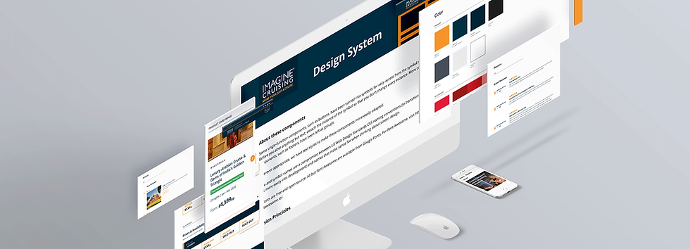
Pattern Library & Tooling:
I implemented the system in Zeroheight, creating a central hub that:
-
Organised components and patterns,
-
Synced with Sketch,
-
Supported tokenisation for future evolution.
This tooling choice future-proofed the system and made it easier to roll out incrementally across the site.

The Solution:
The final system delivered:
-
A fully rebranded, cohesive visual language,
-
A scalable component library with governance,
-
Embedded accessibility standards,
-
Reduced friction between design and development.
As the system rolled out:
-
Design and engineering velocity increased through reuse,
-
Inconsistencies and ad-hoc decisions decreased,
-
The platform became easier to maintain and evolve.
The next phase focused on deeper tokenisation and tighter integration with the tech stack, enabling automated style updates and further operational efficiency.