
Case study:
Icon Creation Toolkit.
Scaling icon quality through tooling, not gatekeeping.

The Challenge.
As Moonpig’s product ecosystem expanded, icons were being created by multiple teams to support new features and campaigns.
While this increased delivery speed, it also introduced inconsistency in visual style and accessibility.
As the sole designer on the systems team, I identified a key risk:
Icon quality was dependent on individual judgment rather than shared constraints.
There was no clear, scalable guidance for:
-
how icons should be constructed,
-
which visual rules mattered most,
-
how new icons should be added without eroding system consistency.
The challenge was to enable teams to create new icons independently, while preserving a cohesive visual language.
Design Strategy.
Rather than centralising icon creation or enforcing heavy approval processes, I focused on encoding design decisions directly into a Figma-based toolkit.
The goal was to:
-
make the “right” decisions the easiest ones to make,
-
reduce subjective interpretation of icon style,
-
support quality at scale without becoming a bottleneck,
-
treat icons as a system, not a collection of assets.
This approach allowed consistency to scale beyond a single designer or team.

Structure & Content.
The icon toolkit was designed as a guided, end-to-end resource covering both principles and execution. Each section was deliberately lightweight and immediately usable.
Core sections included:
Principles of icon design.
A shared set of foundational rules defining clarity and simplicity. Aligning icon craft with brand tone and usability goals.
The base grid.
A standardised grid system defining icon proportions and optical balance across sizes.
Safe space.
Clear spacing rules to ensure icons remained legible and visually balanced when placed alongside text or other UI elements.
Key shapes.
A controlled set of geometric primitives to ensure icons felt cohesive and intentionally designed as a family.
Strokes.
Defined stroke weights and alignment rules to maintain visual consistency and accessibility across different icon sizes.
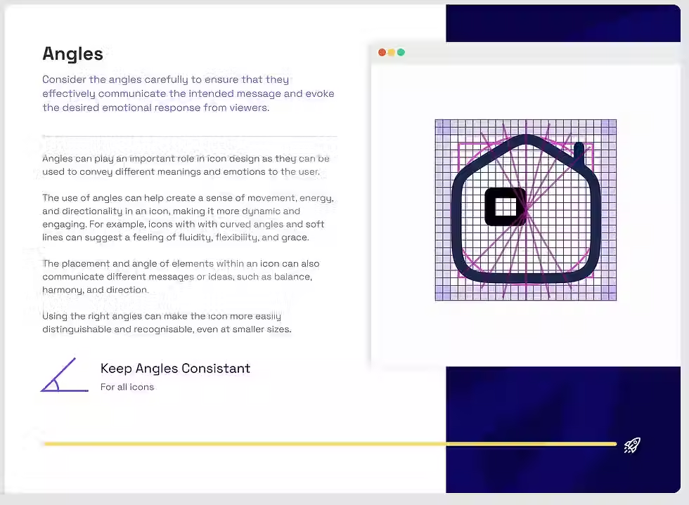
Corners & angles.
Constraints around corner radii and angles to eliminate subtle inconsistencies that compound at scale.
Icon styles.
Clear guidance on supported styles, ensuring teams didn’t unintentionally introduce visual drift.
Each section included annotated examples and practical Figma assets, allowing designers to learn by doing rather than reading documentation.

Collaboration & Rollout.
Although I was the only designer on the system team, I worked closely with product designers to validate the toolkit against real use cases.
The toolkit was:
-
shared as the default starting point for new icons,
-
used during design critiques to align on quality,
-
referenced in onboarding for new designers.
By embedding guidance directly into Figma, adoption happened naturally without requiring training sessions or ongoing enforcement.

The Solution.
The toolkit enabled the team to scale icon creation safely and confidently:
-
improved visual consistency across products,
-
reduced rework caused by misaligned icon styles,
-
faster creation of new icons without system drift,
-
less reliance on a single system designer for quality control.
Most importantly, it shifted icon creation from an ad-hoc activity into a shared, system-led practice.